UX / UI Redesign for a Business Reporting SaaS
Design, user testing and UI implementation to simplify onboarding and report/dashboard creation for a 10-years-proven business reporting SaaS expanding into new markets


The client - Wink Reports - is a Software as a Service company that helps field service and inventory-intensive businesses improve their processes and profitability through the use of reporting, dashboards, and automations.
Wink Reports brought us in to fundamentally improve UX/UI of their product. In particular, the focus was on the onboarding and report/dashboard creation user flows, which had become clunky for non-technical users as the product evolved over the years.
The challenge was to deliver a UX/UI that was user-friendly, intuitive, and functional without compromising any of the key features and functionalities that users were accustomed to. The new design had to be well-suited to the existing user base while also being attractive and engaging for potential new users as the company was in the process of expanding into the United States market.

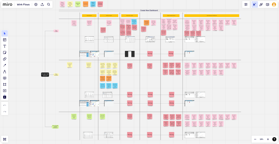
To reach the redesign goals, we began by conducting a thorough analysis of the current platform and sourcing data and feedback from the customer support team. We used this information to begin brainstorming potential solutions to the core design challenges.
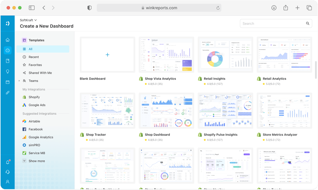
The first challenge that emerged was to properly build the design around a new concept: workbooks. Low-fidelity prototypes enabled us to quickly try various design approaches to implement this new concept. Ultimately, this process led to extensive use of the left sidebar for navigation along with a multi-step wizard concept that included data source selection, data preview, and initial report/dashboard widget configuration.
Additionally, during the early phases of the design process, the team selected the Ant Design System, with the goal of leveraging pre-built components to streamline the design and implementation process.
After testing the low fidelity designs with users, we moved into the high-fidelity design phase and expanded the designs to cover user onboarding, the home page, listing pages, and business reporting-specific elements such as data tables and dashboard widget configurators. During this phase, we leveraged our years of prior experience with building dashboards software.
After the design was thoroughly user tested, refined, and approved, it was handed over to our front-end development team. After implementation, each screen underwent a quality assurance review to ensure it met the project's requirements. Feedback from early users was used to further improve the designs and inform the next iteration of the design.
Throughout the project, we utilized Asana, a project management tool, to communicate and report project progress to the client. Additionally, we held intensive design sessions with the client twice a week using Google Meet, which were recorded to capture all relevant insights and ideas gathered from the sessions. We also used Loom videos and built-in commenting features of the mockup tools to ensure that our communication was both efficient and precise.

We delivered a modern, user-friendly and intuitive redesign of the Wink Reports SaaS UI, achieving the core goals of implementing new features such as workbooks, while also retaining the powerful core features and functionalities that users expect with the Wink Reports software.
The new UX/UI provides users with robust reporting and dashboard creation processes, which improves engagement in-platform and provides a more streamlined experience.
Figma designs were handed-off to our frontend development team for implementatin and has been well recived as clear, precise and covering all the UI component in their varuous states.
Furthermore, the redesigned UX/UI has helped Wink Reports to acquire investor for expansion into the United States.

