Your product's user interface can make or break the success of your project - in fact, 25% of project failures are attributed to UI/UX design issues!
To help you create a successful product, we’ve compiled 14 of the best UI design examples to inspire you in 2025. Through this article, you'll gain a deeper understanding of what makes for good UI design and how to apply these principles to your project.
What is user interface design?
User interface design, often abbreviated as UI design, is the process of a UI designer creating user-friendly digital interfaces that facilitate user interaction with a software application, website, or digital product. UI design involves creating or sourcing:
- Digital components such as menus, buttons, text boxes, and other design elements that enable users to interact with the software
- Navigation systems that help users find the information they need quickly and easily.
- Branding elements like a brand’s logo, color palettes, and typography
- Visual elements like images, animations, custom illustrations, and videos.
Great UI design prioritizes simplicity and usability to create a compelling visual language for the users of the software product or website. A UI designer will use their design skills to design a beautiful, on-brand UI. However, it’s not just about visuals. UX and UI go hand-in-hand, so UX designers are often brought in to focus more specifically on the user journey (i.e. how they complete everyday tasks and use the software).
Benefits of good UI design
It is important to invest in good UI design because it can have a significant impact on the user experience and overall success of a digital product, website, or application. In fact, with experienced UI designers on your team, you can expect to see a number of benefits including:
- Increased user satisfaction. By creating an intuitive interface that allows for easy navigation, users are able to quickly and efficiently accomplish their goals, which leads to increased user satisfaction.
- Improved user experience. A clean and intuitive user experience can help guide users to the desired action and prevent them from feeling overwhelmed or confused.
- Reduced bounce rate. When users can easily find what they are looking for, they are more likely to stay on the website and engage with it.
- Increased user retention and loyalty. A positive experience can lead to increased user retention and loyalty.
- Increased conversions. When a user finds it easy to navigate a website, they're more likely to complete a goal or purchase a product.
14 timeless web app UI design examples
With so many UI design styles, strategies, and trends out there, it can be hard to decide which will work best for your website or digital product. That’s why we believe focusing on timeliness designs is the way to go. By doing this, you can ensure your web app’s UI design will stand the test of time and not need to be reworked after a short time due to a trend going out of style.
So, in this section we will explore 14 of our favorite UI design examples and discuss their key features and benefits, so you can be inspired for your next project. We’ll start with a few high-level design frameworks that you can base your design direction on, then move on to some more specific design elements that can be considered as part of your web app design implementation project.
Let’s get started!
Flat design
We’ll start our UI design examples list off with what’s called flat UI design. It’s a popular approach to website design that seeks to make the user experience as simple and intuitive as possible. The focus is on minimalism and usability, rather than on flashy visuals.
Microsoft is known for using flat design in their Windows 8 and Windows 10 operating systems as well as their other products such as Office, Xbox, and the Windows Phone. They continue this cohesion on their own website.
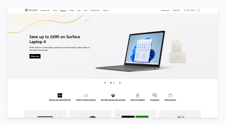
Benefits of flat design:
- Reduces overwhelm: Eliminate the use of gradients, shadows, and other 3-dimensional effects, which can make a website look cluttered and overwhelming.
- Adaptable: Flat design can adapt to different devices, allowing users to access the website from any platform.
- It is easy to customize and update, making it ideal for businesses that need to keep their website up-to-date.
- Simplicity: It uses a minimalist color palette and simple shapes to create an aesthetically pleasing, easy-to-process design that helps users find the information they need quickly.
- Easy to update: Minimal design elements are ideal for businesses that need to keep their website up-to-date and make changes regularly.
Responsive design
Responsive web design is a technique used to create websites that are optimized for different types of devices. Developers use CSS media queries to set breakpoints for each screen size, allowing users to view a website that fits within the parameters of their device.
This approach adjusts column layout, typography sizes, image sizes, and other elements, making sure the website functions remain the same, but the content and structure adapt to different screen sizes.
Samsung's website is a great example of a website that is responsive on all devices. The website will automatically adapt to the specific device it's being viewed on, such as a laptop, tablet, or smartphone.
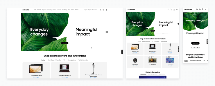
Benefits of responsive design:
- Improved user experience: It provides a better experience for the user by allowing them to easily navigate a website or landing page on any device, without having to adjust the website's content.
- Increased visibility: Responsive design elements make it easier for your website to be found on search engines, as website crawlers give more value to sites that work on both desktop and mobile (both iOS and Android devices).
- Reduced maintenance time: Eliminating the need to create and maintain multiple versions of the same website saves developers time and money.
- Increased mobile traffic: Ensure that your website will look great on any device, which can result in increased mobile traffic and conversions.
Card-based design
Card-based design is an intuitive and visual way to present information and data on websites, mobile apps, and other digital products. It enables users to quickly and easily access, process, and interact with data in a structured and organized way.
Many blogs and content-heavy sites such as LinkedIn utilize card-based design to visually showcase content for users to browse.
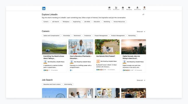
Benefits of card-based design:
- Flexible: It can be used for different types of websites, apps, and products. The applications are really endless!
- Increase discoverability: Easily scannable cards allow users to quickly find what they need.
- Support scalability: Cards are easily customizable and can easily be added, removed, or rearranged quickly.
- Improved navigation: Cards are intuitive and help users easily “click” between pages.
Modal windows
Modal windows are a type of UI design that are used to display additional content without taking the user away from the current page they are viewing. They can be used to provide extra information, display a confirmation message, or allow a user to complete a task.
In order to go back to the primary interface of the program, users must interact with the modal window. As these modal windows are intentionally disruptive, they should be used with caution.
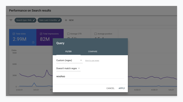
Benefits of modal windows in UI design:
- Minimize scrolling: Modal windows show the users exactly what they need without any need for scrolling or navigation between pages.
- Reduce distractions: Modal windows focus users on the task at hand without being distracted by other content on the page.
- Minimize flow disruption: They can be used to collect user input without having to disrupt the flow of the current task.
- Increase conversions: When used for marketing purposes, they can help convert users to make a purchase, highlight a promotion, or collect user data in exchange for a free download.
Split screen layout
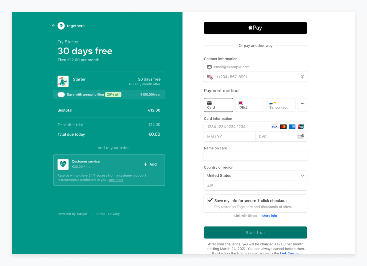
Slit screen layout is a type of user interface design that divides the display into two or more distinct sections. It is commonly used in mobile applications and websites to display two or more related pieces of information or functions at the same time.
It allows users to quickly switch between different tasks or views, without having to navigate to a different page. Commonly, split screens are used during form completion or on purchase pages; however, they can also be used in more non-traditional places like landing pages or within a product interface.
Benefits of split-screen layout:
- Higher conversions: Especially in the case of a purchase page, a split screen allows designers to have all relevant information on one screen, which can help users complete their purchase.
- Enhanced navigation: Users can move between sections of the page quickly and easily, reducing the need to scroll through long pages.
- More creative design options: Split screen layouts offer designers more flexibility in terms of how they arrange the elements on the page and how they use white space, allowing them to create unique and engaging user interfaces.
Progress indicators
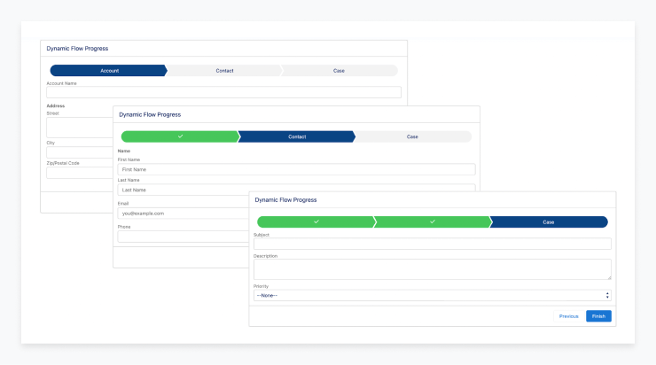
Progress indicators are graphical or numerical representations of progress towards a goal or task. They provide users with up-to-date feedback on the progress of a task or project. Progress indicators are used to inform users of the percentage or amount of progress completed, remaining tasks, and other details related to a project's timeline.
Progress indicators come in many forms. They can be digital, such as a progress bar or a bar graph, or physical, such as a thermometer-style chart or a progress wheel. Whichever form they take, progress indicators are a great way to provide users with the feedback they need to stay focused and motivated.
Benefits of progress indicators:
- Provide transparency: Progress indicators help users to better understand the duration of a task, providing a sense of structure and control.
- Reduce task abandonment: Progress indicators can help to motivate users by showing them how far they have come and how close they are to finishing a task.
- Reduced frustration: Progress indicators reduce user frustration by providing an understanding of how long a task might take and how close they are to completing it.
Mega menus
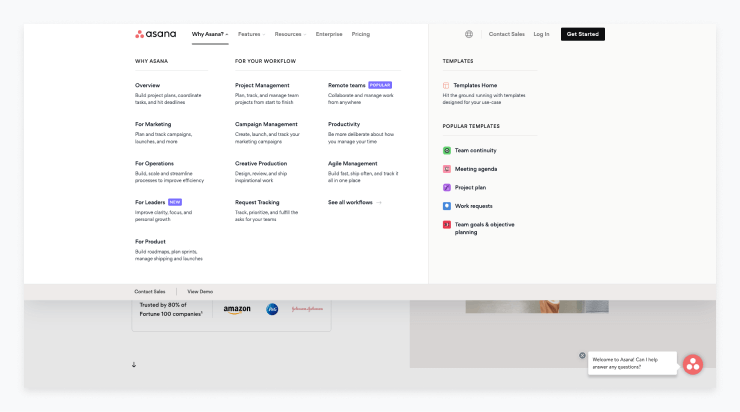
A mega menu is a comprehensive drop-down menu that organizes web content into categories and subcategories. It is an effective way to display a variety of information on a website in a concise and organized manner.
A mega menu is typically used by UX and UI designers when a website has a large number of categories or pages, and the menu is designed to make it easier for a user to find the right page. They can also include images and other elements to provide more visual appeal or assist users in identifying where they want to go.
Asana’s mega menu can provide some design inspiration for teams looking to implement a mega menu.
Benefits of mega menus:
- Gives users the power: This type of menu provides a way for users to look through all options and decide from there where they want to navigate to, eliminating any guesswork.
- Improved navigation: Mega menus allow users to quickly and easily find the content they are looking for without having to search through numerous levels of navigation.
- Increased revenue: For many businesses, it’s simply critical to showcase all of their products and services in one place if they want to convert website visitors into customers.
Carousels
A carousel in UI design is an element that allows users to scroll through a series of images, text, or other content. It can be a great way to make a website more visually engaging, and to provide users with quick access to multiple pieces of content.
However, they do have their drawbacks. Many users simply do not interact with carousels - or even notice them at all! Important information can be lost if it’s not immediately visible when a user lands on a page. Additionally, they can have severe accessibility issues.
Benefits of carousels in UI design:
- Reduce clutter: Carousels can be used to display multiple pieces of content without cluttering the page or increasing the page length.
- Give users options: Especially on a homepage, you may not know what a particular user’s interest is. A carousel can be a way to provide users a jumping off point to various pages on the site.
- Encourages engagement: They encourage users to explore more of the content on a site.
- Great for time-sensitive updates: Carousels can be used to highlight featured content, promotions, and new product updates.
Microinteractions
Microinteractions are an important part of UI design and help to create engaging, intuitive user experiences. They typically involve a single action, such as pressing a button or hovering over an element, that triggers a small animation or change in the interface.
These small changes can provide useful feedback to users, such as confirming an action, or helping to guide them through a process. Done well, microinteractions can make a huge difference to the overall user experience, with subtle yet powerful effects.
Benefits of microinteractions:
- Improved user experience: Microinteractions can provide a more interactive and engaging user experience. This can help to keep users engaged and motivated to use the product or service.
- Increased productivity: Microinteractions can help to reduce the amount of time it takes for users to complete tasks and make decisions. This can lead to increased efficiency and productivity.
- Improved feedback: Microinteractions can provide more immediate and meaningful feedback to users. This can help to reduce frustration and confusion.
- Improved interactivity: Microinteractions can help to make a user interface more interactive. This can help to make the user experience more engaging and immersive.
Conversational UI
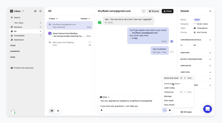
Conversational UI design is a form of UX and UI design that focuses on creating an intuitive, user-friendly experience through natural dialogue. It creates an experience that mimics a real-life conversation, allowing users to interact with a system in a more conversational manner.
Often we see this with support bots or help wizards within web apps that recognize who the user is along with their needs. This type of anticipatory design can help users feel understood in a way that traditionally was only possible on a human-to-human level. Conversational UIs can also come in the form of a voice user interface that uses speed-recognition to provide feedback to the user within the platform.
Benefits of conversational UI:
- Simplified user experience: A conversational UI is a type of interactive design that can be used to simplify complex processes or tasks by breaking them down into simple, easy to understand questions and responses. This can help to reduce the cognitive load on users and make them more likely to complete tasks.
- Improved user understanding: Conversational UIs can provide users with real-time feedback so they can make better decisions and understand what they’re doing. This allows users to feel more in control of their experience, which can make them more likely to complete tasks.
- Increased user satisfaction: By providing users with a more natural and anticipatory experience, conversational UIs can help to improve user satisfaction.
Motion design
Motion in UI design is the use of animation and transitions to improve user experience. Motion in UI design can be used to provide a more enjoyable and interactive experience for the user. It can be used to add personality and life to an interface, and to make it easier to understand and navigate.
Motion can also be used to create an emotional response from the user.
By incorporating motion into a design, it can help to make a product stand out and make it more memorable. Motion should be used sparingly, however, as too much can be distracting and confusing.
Benefits of motion design:
- Engages users: Motion can help draw users in and keep them engaged with the product.
- Enhances feedback: Animations can provide feedback to the user, such as when an action is successful or unsuccessful.
- Improves usability: Motion can help guide users through an interface, providing an additional level of context.
- Creates personality: Motion can be used to give a product an identity and personality.
- Reinforces branding: Motion can be used by a UI or UX designer to reinforce a company’s brand and identity.
Contextual navigation
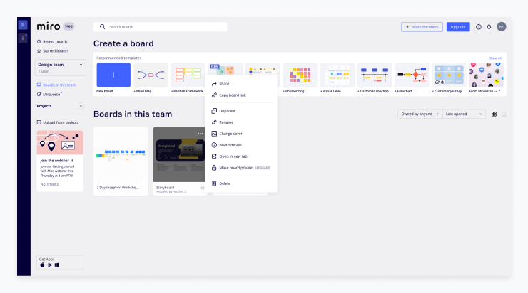
Contextual navigation in UX and UI design is a crucial element for allowing users to quickly find related information within an application or website. It provides easy navigation through the interface by presenting contextual links to other parts of the application, so users don’t need to manually search through all the content.
This type of navigation in UI design is typically found within the body of the website, in between paragraphs and headings, as well as in a dedicated “Related Links” area. Examples of contextual navigation include back, next, or previous links, words converted to links within a paragraph, paragraph headings converted to links, a “Read More” link, and any other link in the body of the page. With contextual navigation, users are able to easily find relevant information, resulting in a seamless experience.
Benefits of contextual navigation:
- Easier to find what you are looking for: Contextual navigation helps users quickly identify the page they are looking for and makes it easier to find the information they need.
- Improved UX: Contextual navigation helps create a better user experience by allowing users to go directly to the page they are looking for without having to search throughout the website.
- More efficient navigation: Contextual navigation allows users to quickly jump between relevant pages and take a direct route to the page they need.
- Improved SEO: Contextual navigation helps search engines understand the structure of the website and can lead to improved SEO rankings.
Infinite scrolling
Infinite scrolling is a UI design approach that allows users to continuously scroll down a page, loading new content as they go. Instead of providing a traditional “next page” option, users can scroll indefinitely and view an infinite amount of content. This type of design is most often used in social media applications, and can provide a novel, immersive experience for users. Many ecommerce sites, including Nike, have infinite scrolling in place to encourage users to keep engaging with their site.
Benefits of infinite scrolling:
- Improved user experience: Infinite scrolling helps improve the user experience by making it easier to explore content. By eliminating the need to manually click on a "next page" button, users can quickly browse and find what they are looking for without having to wait for a page to load.
- Increased engagement: By using infinite scrolling, users are more likely to engage with the content for longer periods of time. This allows for more opportunities to capture user attention and lead them to take action.
- Improved performance: Infinite scrolling can help improve page performance, as less data needs to be loaded for each page. This helps speed up the user experience, making it more enjoyable.
- Increased accessibility: By implementing infinite scrolling, users with disabilities can more easily browse and access content. This helps make sure that all users are able to access the content on the site.
Search bars
Search bars in UI design serve as an integral part of a website or application, allowing users to quickly and easily find information. A well-designed search bar should be accessible and easy to use, blending seamlessly into the overall design of the website.
In addition, useful features like autocomplete and filters can be incorporated to provide users with more accurate search results. By creating an intuitive and effective search bar that provides quick results, users can more easily find what they are looking for, improving their overall experience with the website or application.
Benefits of search bars:
- Easier access to content: A well-designed search bar allows users to quickly and easily search for content on the website instead of manually navigating through the website.
- Increased user engagement: Search bars provide an intuitive way for users to find the content they’re looking for, which encourages them to stay longer on the website and explore more content.
- Improved customer service: Search bars make it easier for customers to find answers to their questions without having to contact customer service.
- Increased website traffic: A well-designed search bar can help drive more traffic to the website by providing users with an easy and efficient way to find what they’re looking for.
Emerging UI trends
One of the most exciting aspects of user interface design is how rapidly it evolves. Each year, new styles and techniques surface, driven by technological advancements, user preferences, and creative experimentation.
Below are top two emerging trends in 2025. By experimenting with these trends, you can give your product a modern edge while enhancing user engagement. Always remember to validate your choices through user feedback and analytics.
Bold 3D icons
Flat design has long been the mainstay of modern interfaces, but bold 3D icons are making a comeback. These icons provide a tactile feel, adding depth and realism to otherwise minimalistic layouts. To adapt this trend effectively, focus on balance: 3D elements should grab attention without overshadowing essential text or functionality. Use subtle shadows and highlights to maintain consistency with your brand’s color palette. If you’re worried about performance, consider using vector-based formats or optimized 3D renders that won’t slow down your app or website.
![]()
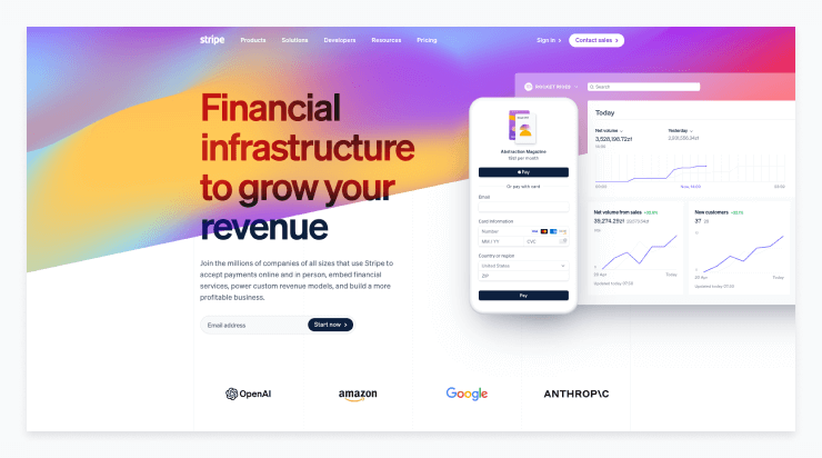
Dynamic gradients
Gradients are no longer limited to gentle color transitions. Designers are experimenting with vibrant, multi-tone gradients that shift and flow, creating a sense of movement on the screen. The key is to use dynamic gradients strategically so they enhance, rather than distract from, your content. Employ them in backgrounds, hover effects, or as accents on interactive components.
Conclusion
UI design is an essential part of any custom web application development project, and it’s important to invest in good UI design to ensure the success of your product. By looking at the 14 timeless UI design examples above, you can get inspired and learn from the best. Keep in mind the key benefits of good UI design, like increased user satisfaction, improved user experience, and increased conversions.
As you begin your next UI design project, remember to focus on the user experience and keep your design simple, consistent, and accessible. With these tips, you can create a powerful and successful user interface that will delight your users.




![How to Design a SaaS Product Users Will Love [with examples]](/uploads/blog/saas-design/saas-design.png)